Let’s say you have collected likert scale data at pre and post some sort of intervention, and you want to see if the intervention has changed people’s opinions.

Notes:
1 – To properly test the effects of the intervention, it is best practice to have a control, for a before-after-control-impact designed study. This is not always possible, and as such we will limit discussion to before-after data.
2 – Likert scale data is really ordinal data. Unless your sample size is large (say greater than 100), you are probably going to want to use a non-parametric method to test for significant changes in opinion. But with a smaller sample size, there are more options for visualising the data.
For likert scale data, I like to use divergent bar charts. The following graph was produced using the R library, likert.

Looking at the divergent bar charts, it appears that the post intervention responses are slightly more positive than the pre intervention data. However this graph does not take into account the paired nature of the data. Given the small sample size, it is possible to plot individual changes in opinions.

This shows that, for example, all individuals who originally strongly disagreed, tempered their opinions post intervention. The graph may get a little busy with more participants. Another way of presenting is through a heat map representation of a transition matrix.
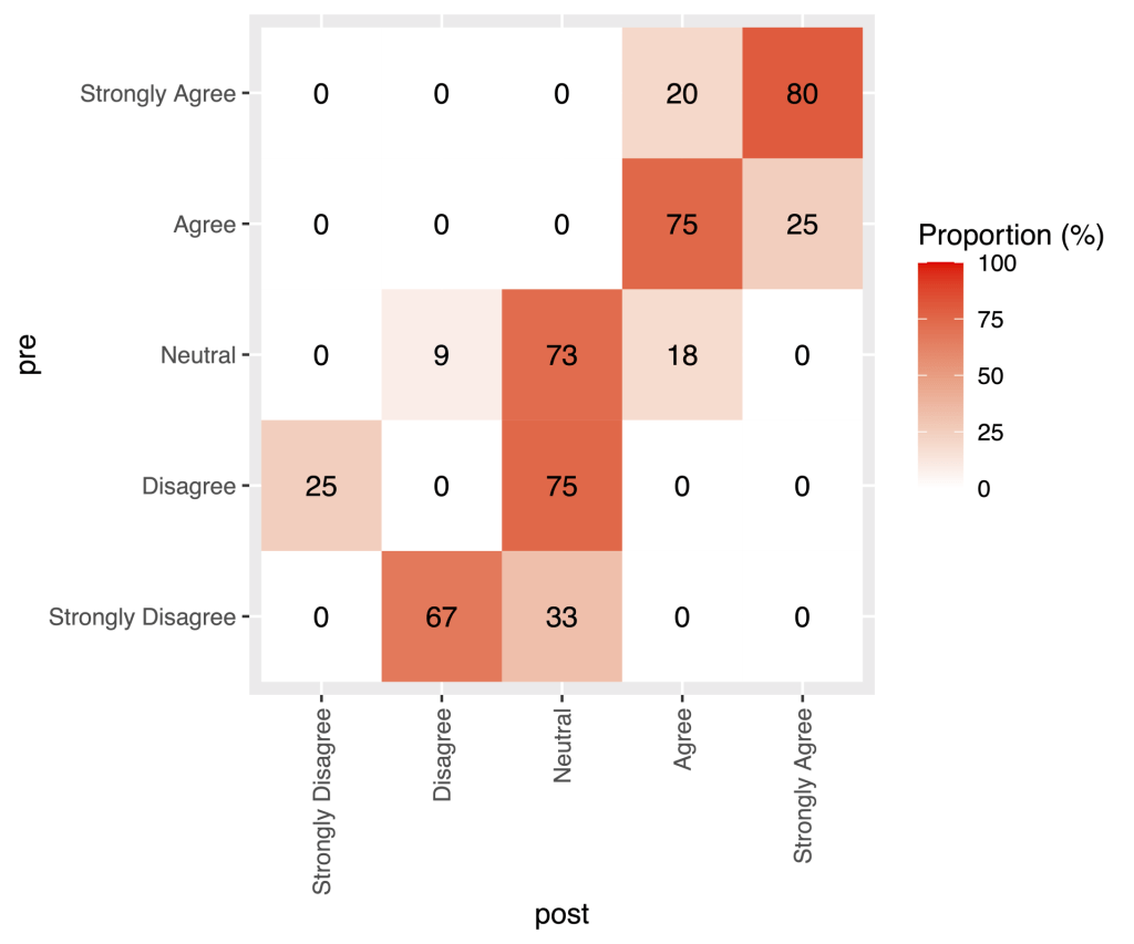
This graph shows that most participants retained the same opinion, or had a more positive opinion post intervention. The same data could also be represented using bar charts.
Since we essentially have a transition matrix, we could represent this as a network. However this does suggest ongoing transitions, while the data is based on one transition (from pre to post).

Finally, to test for significant change in opinion from pre to post intervention, I would suggest a non-parametric equivalent to the paired sample T-test, such as a Wilcoxon signed rank test, a permutation test or a bootstrap test.
For this data, the wilcoxon signed rank test showed a significant change in opinion from pre to post intervention (V=21, p-value=0.018).